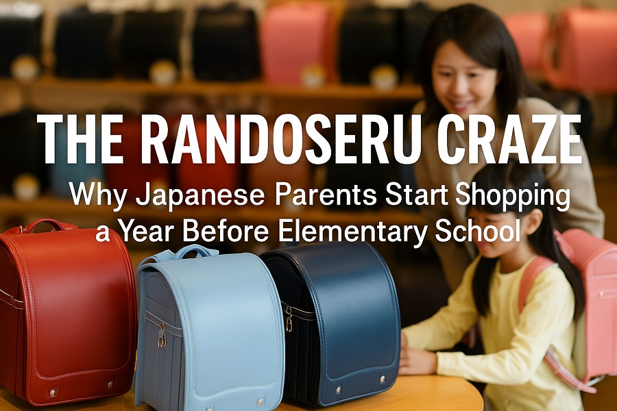
Discover the cultural meaning behind Japan’s iconic school backpack—the randoseru. Learn its history, design, and why Japanese children carry the same bag for six years.

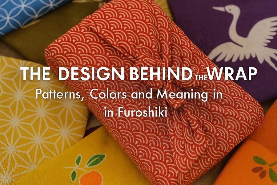
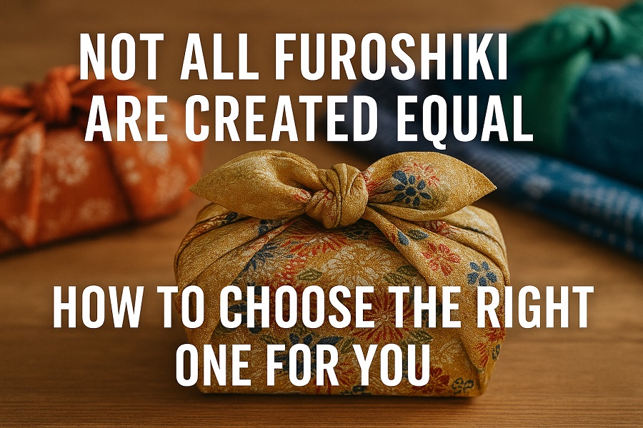
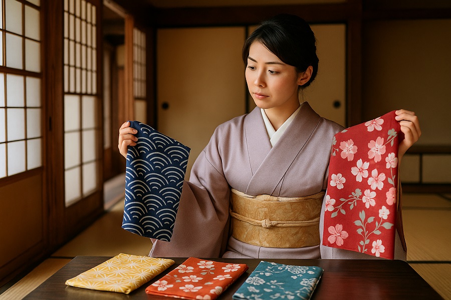
To the untrained eye, furoshiki may seem like “just a colorful fabric.” But to those familiar with Japanese culture, every pattern, color, and design choice tells a story.
From waves and cranes to seasonal flowers and sacred geometry, furoshiki isn’t only functional—it’s a visual language of meaning and emotion.
Let’s unwrap the hidden messages woven into each piece of cloth.
Furoshiki is both practical and expressive. Unlike commercial wrapping paper, furoshiki is:
When you wrap with a furoshiki, you’re not just giving something—you’re saying something.
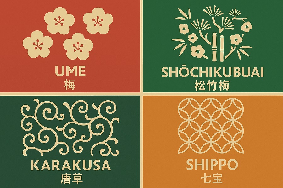
Here are some of the most common motifs found in furoshiki—and what they symbolize:
| Pattern | Japanese Name | Meaning |
|---|---|---|
| Waves | 青海波 (Seigaiha) | Calm seas, peace, and long-lasting fortune |
| Hemp Leaf | 麻の葉 (Asanoha) | Growth, protection, especially for children |
| Tortoiseshell | 亀甲 (Kikko) | Longevity and strength |
| Crane | 鶴 (Tsuru) | Happiness, good luck, and long life |
| Plum Blossom | 梅 (Ume) | Resilience, as it blooms in winter |
| Pine, Bamboo, Plum | 松竹梅 (Shochikubai) | The “Three Friends of Winter,” symbols of celebration and perseverance |
| Vines | 唐草 (Karakusa) | Continuity, prosperity, and family lineage |
| Seven Treasures | 七宝 (Shippo) | Harmony and infinite connection |
Each design can turn a simple wrapping into a visual wish for the receiver.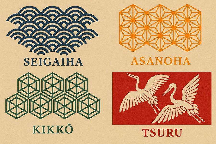
Colors in Japanese culture also carry emotional and seasonal weight:
Choosing the right color combination elevates the meaning of your gift.
For weddings: cranes, pine, or auspicious symbols
For babies or children: asanoha (hemp leaf), soft animal prints
For business or formal settings: subdued geometric designs or classic motifs
Contemporary designers are blending traditional symbols with:
This keeps furoshiki relevant and accessible, while still rooted in meaning.
Every furoshiki is a visual poem—speaking softly through color, pattern, and tradition. Whether you're wrapping a gift or wearing it as a scarf, the design you choose isn’t just decoration.
It’s a quiet form of expression. A story told without words. A gesture wrapped in meaning.
So next time you select a furoshiki, don’t just think about what’s inside—consider what the outside is saying, too.
Want help choosing the perfect pattern for your next gift? Explore our illustrated furoshiki pattern guide (coming soon).